
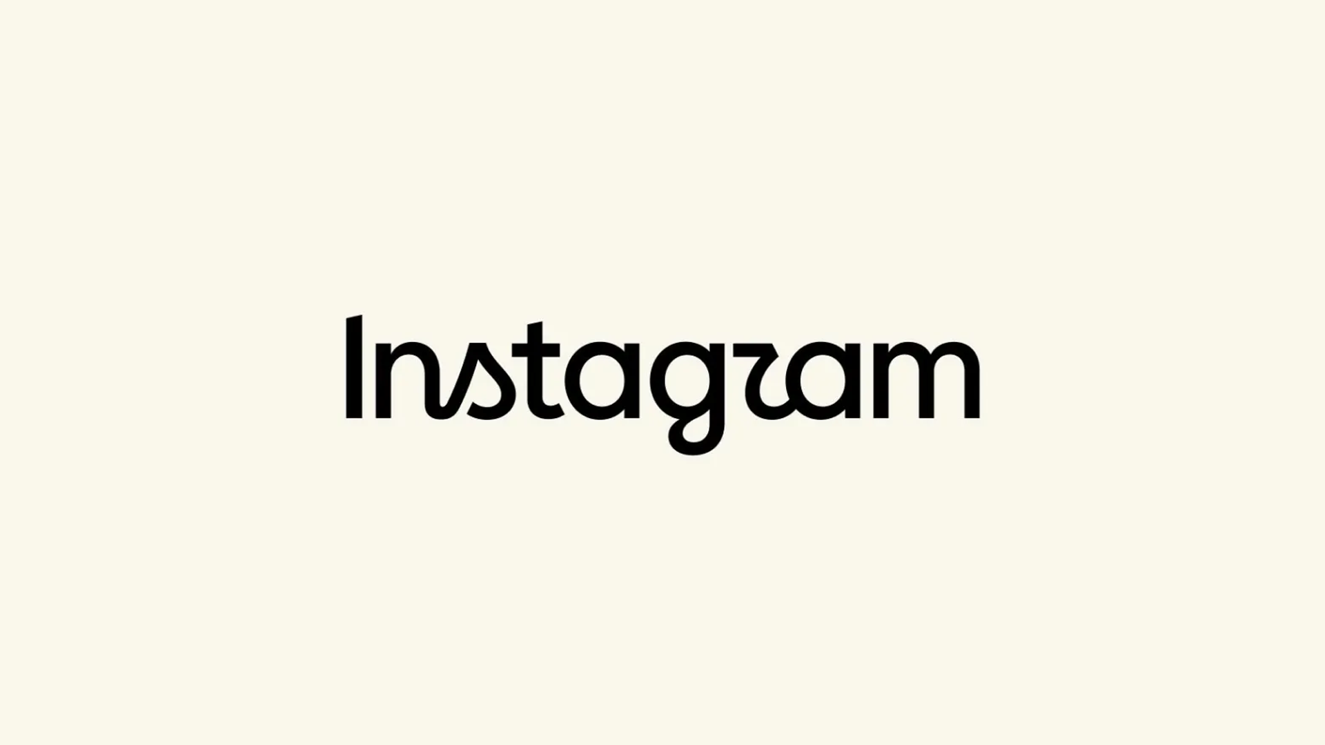

Instagram has given one of the most recognisable names in social media a new look, refreshing its wordmark for the first time in around a decade.
The change replaces the familiar cursive-style wordmark introduced around the time of Instagram’s major 2016 redesign with lettering that mixes handwritten and more conventional forms. The app’s well-known gradient camera icon is not being replaced as part of this particular change.
Why Did Instagram Change It?
Instagram head Adam Mosseri described the refreshed design as cleaner and more modern while retaining links to the character and craftsmanship of the previous identity.
It may be a relatively small visual change, but it is one that regular Instagram users are likely to notice — particularly given how long the previous wordmark had been around.

And People Have Opinions
As you might expect when a familiar brand changes its appearance, the reaction has been mixed.
Some users have welcomed the more modern style, while others have questioned the readability of some of the new lettering. One particularly common joke online is that the new wordmark can initially look like it says “Instagzam”.
Whether you prefer the old or new version, after roughly a decade of seeing the familiar script, this one might take a little getting used to.